James Kirkwood
UX - UI - Creative Direction - Art Direction - Conceptualisation
Rubik’s Match - UI Consultant
My Role
I was responsible for creating, refining and expanding the UI style for a new Match 3 game based on the Rubik’s Cube IP for Nørdlight; a game studio owned by Spin Master.
The game had already been in development for a year or so, but there had not been anyone working as a dedicated UI artist before my arrival and the meta was still at an early MVP stage. So there was a lot to do!
Over the first few months I worked very closely with the Studio Art Director to define UI style that would work sympathetically with the game art style.
I also collaborated with the Lead Game Designer to come up with a series UI/UX concepts for the meta flow. Where the player would be able to earn rewards from the switcher and then use them to build a whole set of themed worlds.
Later I was joined by another UI/UX designer and we worked together with her looking after much of the UX side of things and me leading the UI work.
Iterative Process
I took the flavour of the designs that I inherited when I joined Nørdlight and distilled this down, refining, calming and balancing the screens to help give the game a more polished feel. Migrating everything over from Photoshop over to Figma as I went. I had to move fast as I only had two months to supply a full set of reworked screens and get them implemented for our soft launch. This first set of iterations was a great stating point and over the next year I’d refine this style further as we experimented with different game design and UX concepts.
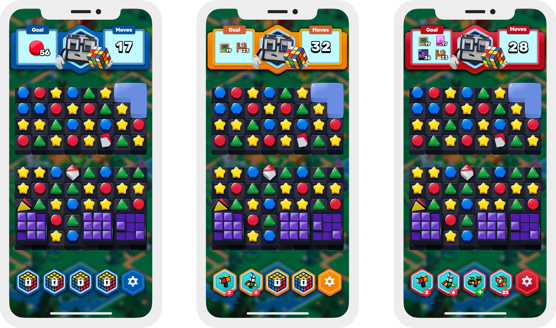
Bellow are a couple of examples of the iterative process with the initial screens on the left, the soft launch screens in the centre and final screens on the right.
The initial home screen displayed progression to the player as a saga map. As the game grew in complexity I generated many iterations of this screen, allowing players to navigate between the game’s core features and live ops.
Early versions of the PGP had no difficulty labelling and as the game evolved we added a streak feature and a new element progress bar. it was important to keep this screen super clean and we added new features to it.
Styling Overview
We wanted to make a game stood out form the huge amount of Match 3 games on the market. Our product needed to reflect the Rubik’s brand, appeal to all genders and where ever possible to have a hint of 80’s nostalgia. The UI style I developed with the studio art director has four main components to it.
1. Chunky - Plastic & Tactile
3. Rubik’s Branded Colour Palette
2. Cubes & Square Motiffs
4.Retro - 80’s Nostalgia
Chunky - Plastic & Tactile
All of the UI elements are rendered so that they look like they are made from the same hard plastic material as the environment’s assets, the game’s characters and the Rubik’s cube itself.
We deliberately avoided adding to many fussy bevels or frames. The intention to give everything a clean and satisfyingly chunky feel.
Shadows and bevels were employed to give the components a tactile, 3D feel.
Cubes & Square Motifs
To help emphasise the Rubik’s theme I used the hexagon/cube shape throughout the UI, and replaced everything that would naturally be a circle or and ellipse with a cube or square.
We also gave the icons a chunky cube-like vibe, with me mocking up the concepts for each one and then handing them over to the art team to work their magic.
I was especially pleased with how the diagonals from the UI housing echoed the isometric lines of the environments that they sat in front of.
Rubik’s Branded Colour Palette
I based the game’s UI colour palette on the six core Rubik’s Cube colours. With each colour having it’s own particular set of uses and symbolism.
White for the main pop up panels
Blue for regular difficulty and all core UI paneling
Orange to indicate hard levels and progression and secondary CTAs
Red for super hard levels, reward banners and badges
Green for positivity; CTAs and rewarding checkmarks
Yellow for premium; buildable objects and offers
Difficulty Label
Regular
Difficulty Label
Hard
Difficulty Label
Extra Hard
Retro - 80’s Nostalgia
The game has a very strong 80’s nostalgia feel running through it. With floppy disks, fruit scented markers, cassettes etc. as blocker in the switcher.
To compliment this I used an 80’s chrome style effect for the screen’s titles. I took this even further with the ‘That’s a Match logo’ with it’s signature 80’s shocking pink handwritten font.
To keep with this retro theme, I used a bright shade of turquoise for the text highlight, synth-wave grids as background decoration and neon glow effects as dividers.
Growing The MVP Out Into A Full Game
In my time at Nørdlight, I built out the UI screens out in a systematic way to include -
Tooltips
Settings
Player Profile Screen
Sky Trials - Live Ops
Erno’s Challenge - Live Ops
Shape Harvest - Live Ops
Switcher HUD variants
Meta Build Menus
Shop
Time Limited Offers
Core Loop Pop Ups
Daily Missions
Reward Screens
Core Screens
Switcher HUD
Pre Game Screens
End Game Screens
Consequences
Level Failed
Home Screen
Build Menu
Shop
Time Limited Offers


