James Kirkwood
UX - UI - Creative Direction - Art Direction - Conceptualisation
Candy Crush Saga - Associate UI Director
I was incredibly excited and honoured to get the opportunity to work for King as Associate UI Director on Candy Crush one of the most successful games of all time. At the heart of this is a quirky mixture of two contrasting styles: highly rendered 3d game pieces and 2d paper craft game art reminiscent of mid century children's books; these two styles are bridged with the iconic Candy Crush UI.
My Role As Associate UI Director my role was to -
Lead all global UI initiatives for multiple teams reporting to Area leads based in Stockholm, Berlin and Barcelona
Share best practices of efficient work with UI designers, UX Designers, Game Designers and Game Artists
Work with the other Product Craft Directors to safeguard, influence and enhance the quality of Candy crush
Provide 1 to 1 mentoring and feedback with the UI team
Improve the creative guidelines around UI art for Candy Crush
Features and improvements that I helped with
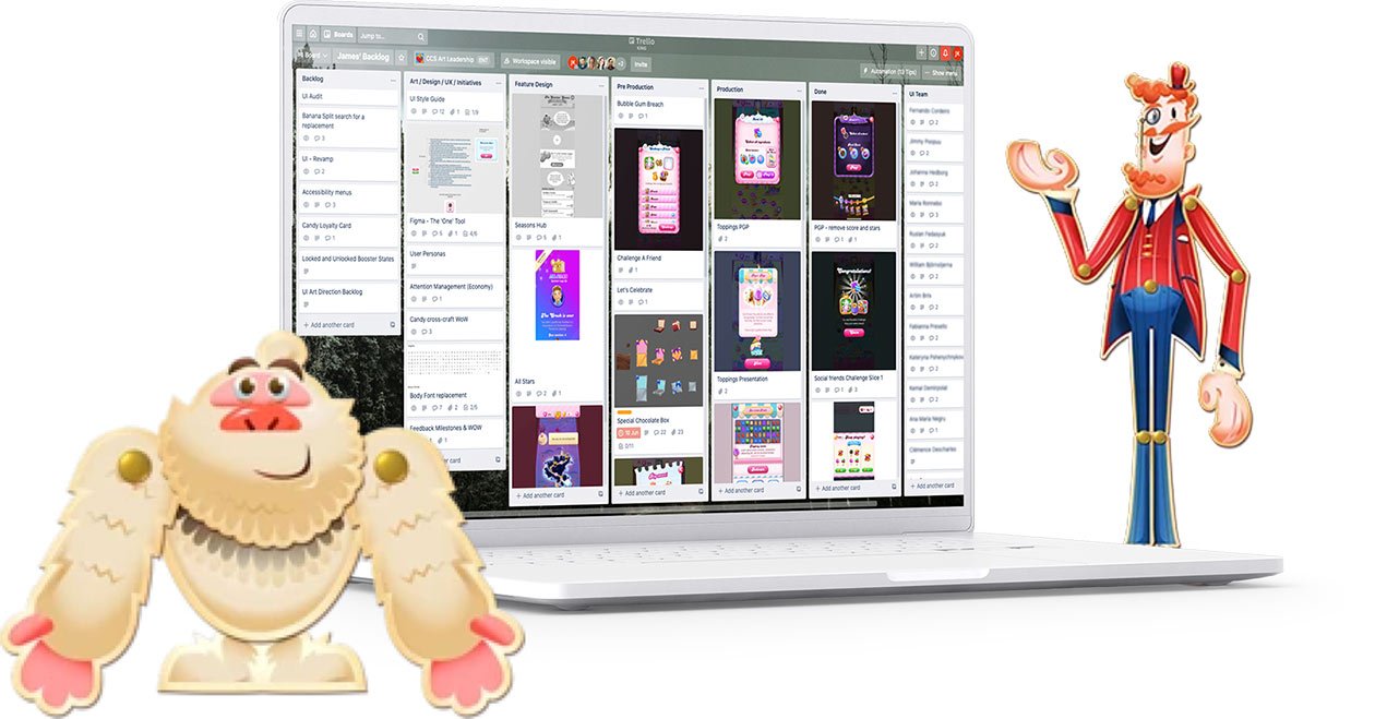
Candy Crush is a large and complex product with 11 teams reporting to 6 Area leads based in Stockholm, Berlin and Barcelona. At any one time there are always a considerable amount of new features and improvements being worked on at Candy Crush, to improve retention, engage new players and improve monetisation. Not all of these make it into the live game, but bellow are some of the initiatives that I was lucky to work on during my time at King that did.
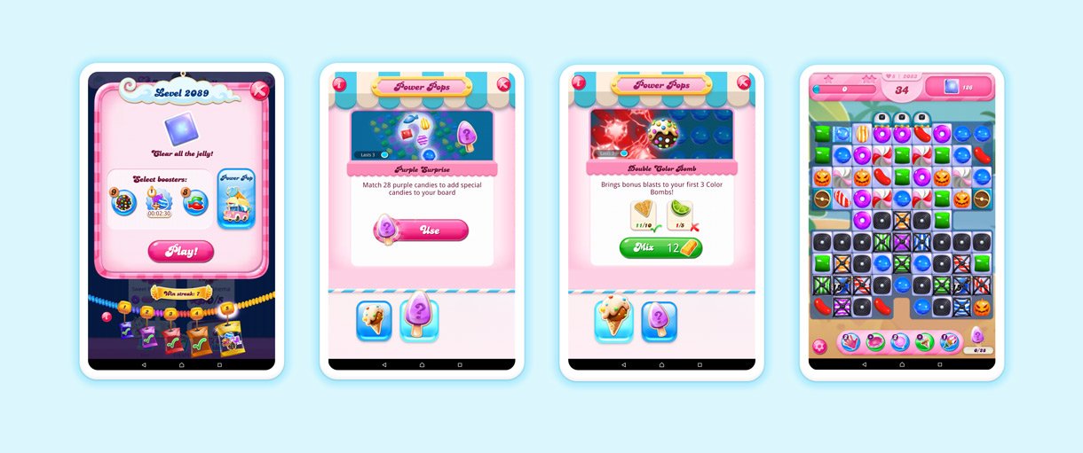
Power Pops
This was one of the larger features that I gave day to day feedback on working closely with the Associate Narrative Design Director, Game Design Director, Game designer, UX designer UI artists and game artists.
It gives players the ability to create new boosters that they could craft for themselves from ingredients which are either purchase with gold bars (hard currency) or collected by completing levels. Adding another layer to the gameplay.
The narrative design was a key part of the work here, with Yeti and his old timey ice cream truck introducing players to the feature on the saga map and inventory UI.
The Daily Treat Machine
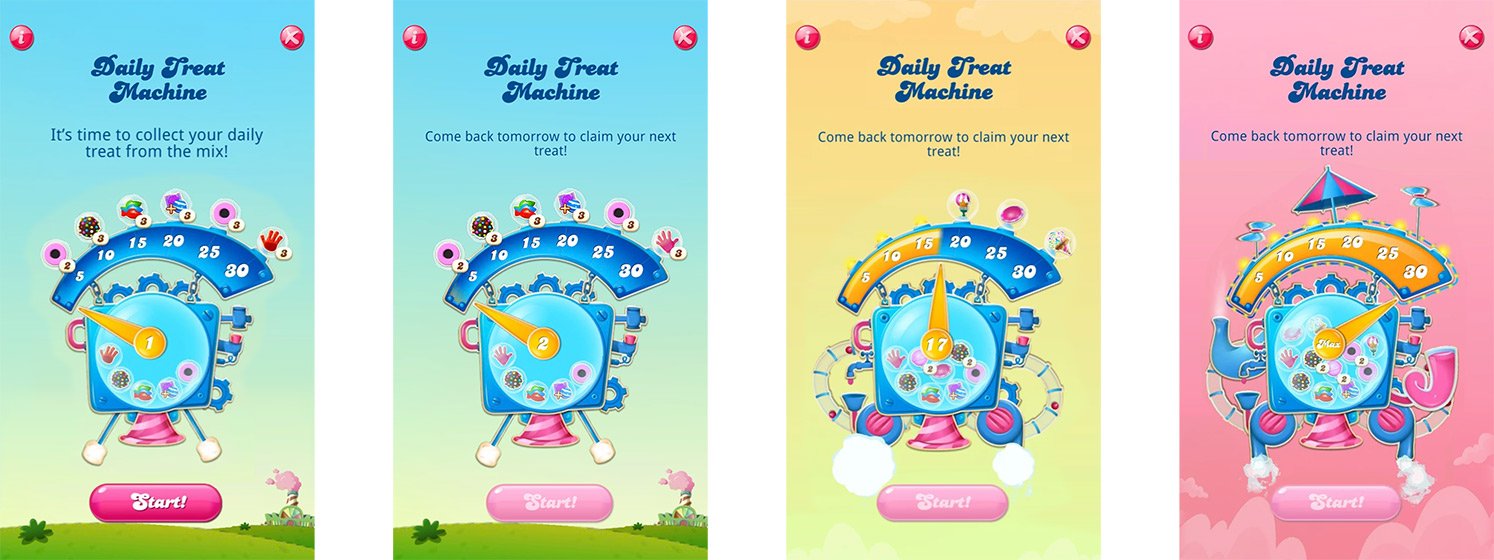
The Daily Treat Machine allows you to claim sweet rewards when you log into the game. The machine’s meter has six tiers. Each tier is a 5-day login streak. For every tier you reach, the daily reward will increase in value. The higher the tier, the better bonus!
This feature went through quite a few iterations before the team and I landed on the final design. It was important to strike a balance between having an eccentric machine full of excitement and wonder, whilst at the same time ensuring that the individual elements where all easy to read, that they all looked like they joined up together and that each new element added clearly to the silhouette as the machine grew on return visits.
End Of Game Pop Up
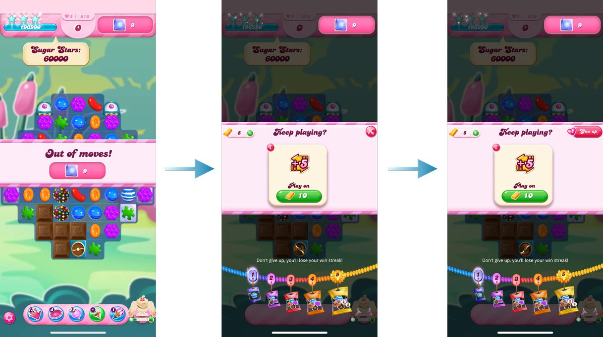
The End of Game Pop Up or EGP is a very important screen form a commercial standpoint, it was also one of the least satisfying screens in the product from a visual perspective. So it was great when we got the opportunity to rework it. I wanted the new design to have a simpler, chunkier and slightly more harmonious feel. The business requirement was to make the payment CTAs more prominent.
One of the core UX improvements with the new end of game flow was that the level target would always to remain highlighted. through out this part of the experience.
Pre game pop up
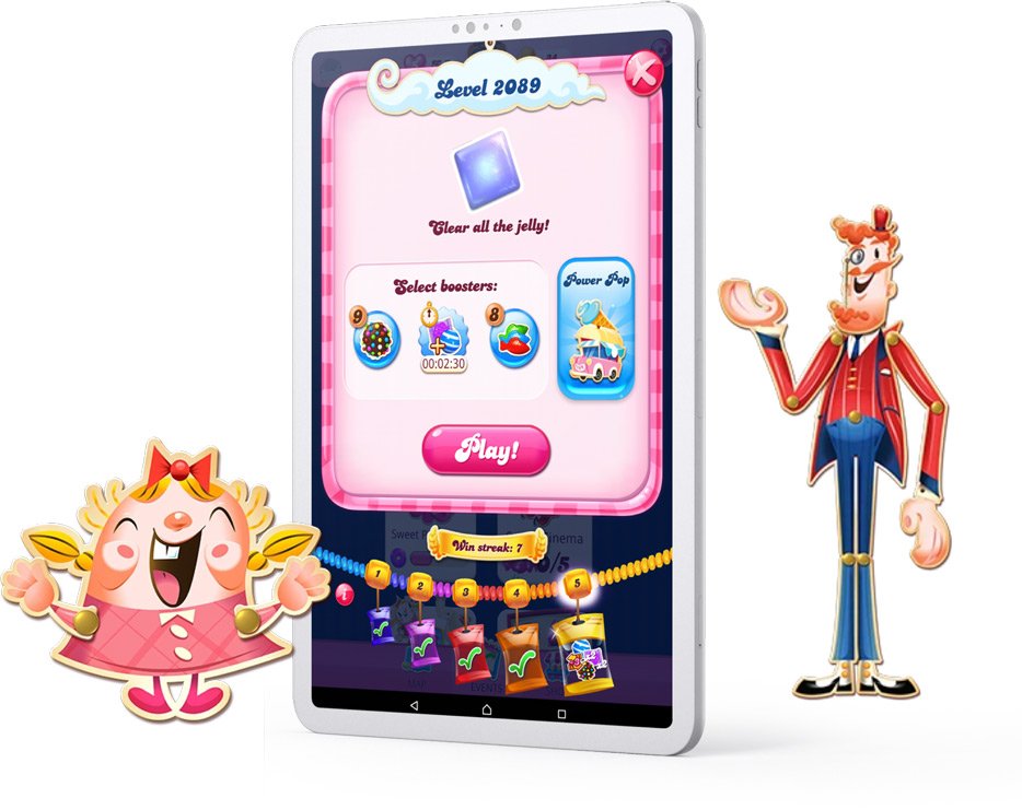
Sometimes it’s a lot harder to remove a feature than to add a new one. With a product as complex as Candy Crush it’s hard to find out who owns what, locating decision makers isn’t always as easy as it should be. Removing the sugar stars and target score simplified the design of the pre game pop up allowing all of the elements to breath, giving the screen a more harmonious feel without impacting on the players experience.
The removal of the sugar stars and target score gave the Power Pop team the space they needed to showcase their new feature.
